
For decades in P&C, the market absorbed a steady climb in premiums year-over-year, allowing for a certain amount of what we’ll call operational imprecision. A report that's a little off, or a few decisions made around raw data was fine, because there was margin to spare.
But that era has planted itself firmly in the past—evidenced by the industry reports and global outlooks we’ve all read from the likes of Deloitte, Verisk, and APCIA—P&C is moving from a prolonged cycle of increases into a period of margin pressure and slower premium growth. Under the weight of heightened competition, lessening momentum, and emerging cost pressures, carriers have done well to see the reality at hand. With the cushion thinning, their task isn’t an easy one: move faster and be more accurate, at the same time.
AI and analytics-driven decisioning like automated triage, policy intelligence, and agentic claims handling have come to market as the answer to a “need for speed.”
But, as we know, speed built on bad inputs only escalates risk. Which falls short on the “and be more accurate” piece carriers need to compete.
“Slop in, slop out” has become the unofficial slogan for enterprise AI in almost every industry report and outlook. But its redundancy doesn’t make it less appropriate. What separates the orgs solving for it is how they answer its root-cause question, “What, specifically, makes the data ‘slop’ in the first place?”
The best answers we’ve heard (and helped our customers arrive to) are not glamorous. More like a hundred small, very unglamorous questions strung together about whether your data can represent reality precisely enough to be trusted.
In their outlook, Deloitte describes P&C as “buzzing with AI activity”, but notes realizing its value remains a work in progress as insurers struggle with fragmented, messy data sprawls caused by outdated systems that never anticipated how valuable that data would become.
Everyone has adopted technology, so it’s a disservice to pretend that’s still the race we’re in. Now, the differentiator is whose data is precise and clean enough to make that technology worthwhile.
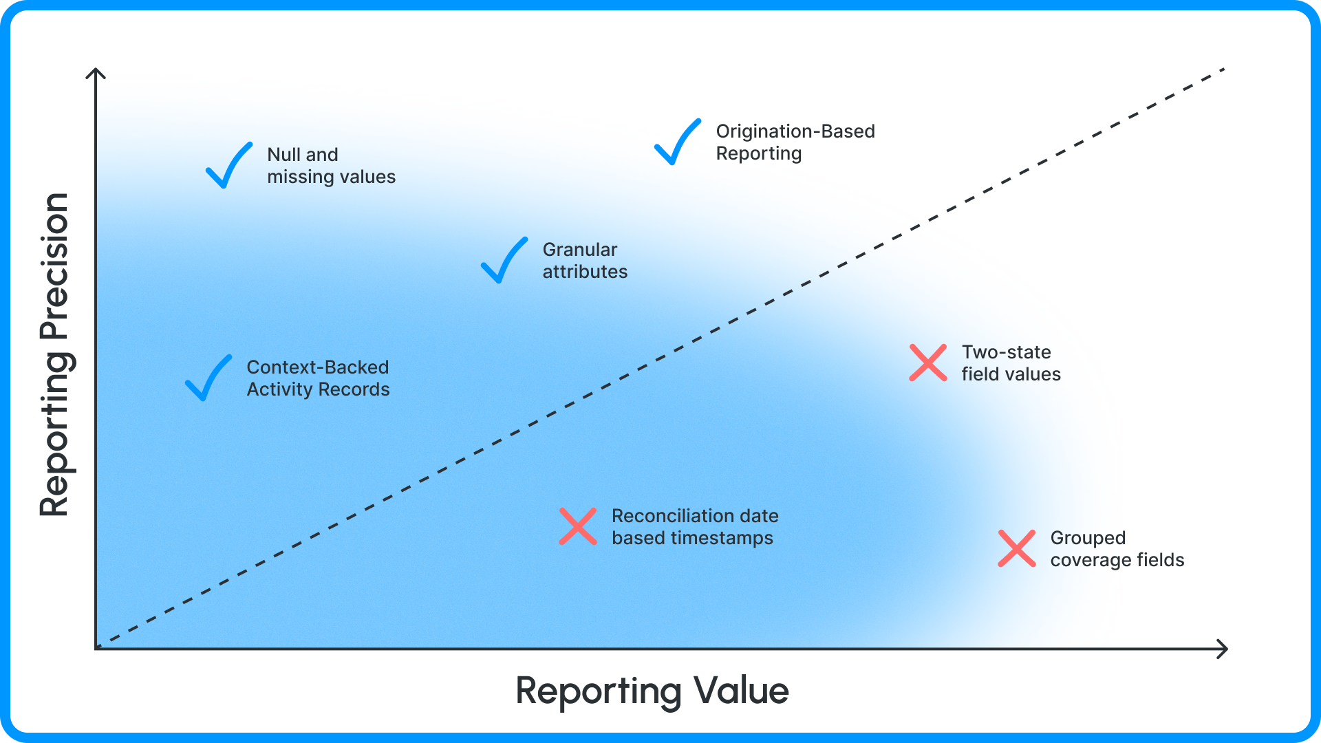
In claims reporting, the level of detail in your data determines the level of value your organization can derive from it. Every increment of granularity not only makes the reports more accurate, but sharpens the decisions teams make on the other side. “What’s going wrong” is as valuable as “what’s going right”, and there are four common ways that granularity breaks down in data.
The ambiguity of missing data and two-state systems
When reporting can’t tell you the difference between “no” and “we don’t know”, that means it’s not identifying critical missing data, skipped steps, or potentially incorrect outcomes. Things like the wrong automation step triggering, an incorrect set of rules being applied to a task, or the wrong escalation path being initiated because one “no” was actually an empty field.
A lot of systems force fields into a two-state format or lack format consistency everywhere a field is used (two-state format here, three-state format here, boolean value here but single-text format there).
Take a field like Potential Total Loss for an auto carrier. If that field returns “false” on 10,000+ claims because “null” or “missing” isn’t an option, how do you know what percentage of those 10,000 claims were genuinely assessed as not a total loss versus how many were simply… never evaluated? The clean collection of “false” values on your report no longer matters, because there is no way to build an accurate analysis of it. Key decisions around total loss rates, adjuster completeness, and triage effectiveness inherit that same level of ambiguity.
Null-value support is consistently one of the most mentioned features by Snapsheet Claims Platform customers because it translates missing data into specific, reportable values that definitively separate the false from the incomplete. Reports can distinguish things like "assessed and determined" from "never assessed” so claims managers can see the difference at a glance without relying on assumptions. The “Has Value” operator available across dropdowns, dates, datetimes, and workflow triggers keeps that distinction intact in every report a manager runs.
The discrepancy between moment of origination and moment of reconciliation
This one is more subtle (and much harder to catch) because it usually applies to data that is correct… but it’s filed under the wrong moment in time. Period-level accuracy is mission critical in high-value reports like loss development, monthly financials, cycle-time trends, and reserve accuracy over time.
Take, for example, a backdated payment. If the transaction occurred in March, but wasn’t entered and initiated until April, it lands in April’s numbers in most systems. One period is overstated while the other is understated, and it can take hours to diagnose because the bad data isn’t technically bad.
Temporal granularity is the Snapsheet solve for this type of discrepancy. Reports in the Snapsheet Claims Platform can bucket financial activity by when a transaction originated, not just when it was entered. Exposure-level timestamps can also be set precisely and retroactively (when an exposure was opened, first closed, closed, etc.) to preserve historical records so moving data between systems doesn’t scramble the claim timeline, or lose point-in-time context.
The miscategorization of correct data
The data is present. The data is correct. But the data is in the wrong place. Another failure that’s impossibly hard to catch because nothing looks absent, and nothing looks wrong (at first). But it’s filed under the wrong heading, and that throws off every aggregate it’s included in. And miscategorized filings can affect very important processes like ISO reporting, coverage validation, reserve settings, and loss calculations.
In complex books of business, Coverage Names and Coverage Codes are not always perfectly matched values, especially when it comes to secondary and supplemental scenarios. So in Snapsheet, it’s two different fields so teams can both report and automate on the exact coverage dimension they mean. The same granularity applies in total-loss settlements, where figures that systems have historically lumped together are broken down into granular attributes like condition adjustments, valuation subtotals, post-tax adjustments, and negligence reductions so settlements are reported and audited according to the right pieces rather than as a single opaque number. Replacing a coarse bucket with a precise set of tools ensures reports reflect distinctions that have always been real but never quite visible.
The “lying by omission” committed by missing context
There’s the black-and-white accuracy reporting, and then there’s the usefulness of reporting. The second can be correlated 99% of the time to the question: “We know what happened, but do we know why it happened?”
If a claim history shows the precise moment a field value changed on the file, that’s accurate. But does it tell you it changed because a specific workflow action fired? That an adjuster changed it after a communication thread with the policyholder? That there was an error in coverage validation that was correct?
Snapsheet keeps carriers out of gray areas with the ability to link claim history records back to workflow actions or user initiations to distinguish automated activity from human activity in reporting. This becomes the raw material for carriers to understand how much of their process is running on autopilot versus how much is requiring manual intervention (which becomes very important when you want to, say, assess the ROI and value of a new AI or automation tool you’re piloting in operations).
In every use case, granularity becomes both a diagnostic instrument and an efficiency driver. Accurate reporting supports data-driven decisions by claims managers, but granular reporting informs better decisions about the processes that data is built on. When you can distinguish “never assessed” from “assessed and cleared”, broad questions like “What percent of claims stalled?” become, “What percent of claims stalled at this step, and why?”
The ability to separate automated actions from manual ones makes it ebay to see where automation is carrying the load and where people are still the ones picking up the slack. Which means you know what’s working and what requires improvement in a glance.
In every case, clean categories and honest timelines replace artificial aggregation with trend spotting that teams can act on in real-time.
And isn’t that the point of measuring it all in the first place?